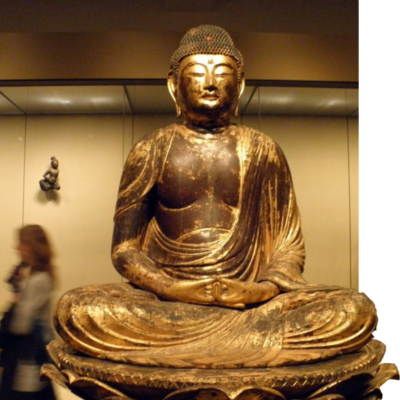
Asian Art Museum - Masterpieces
Asian Art Museum’s Masterpieces App
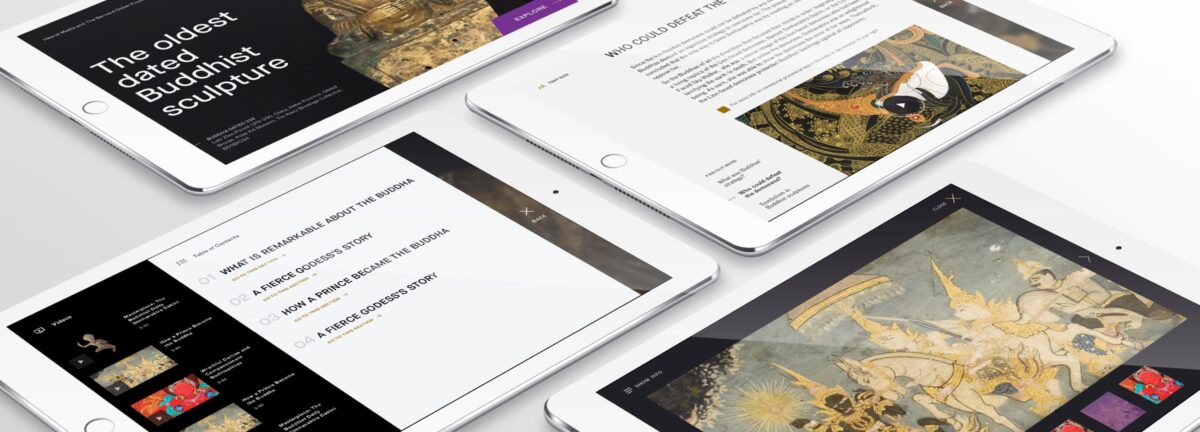
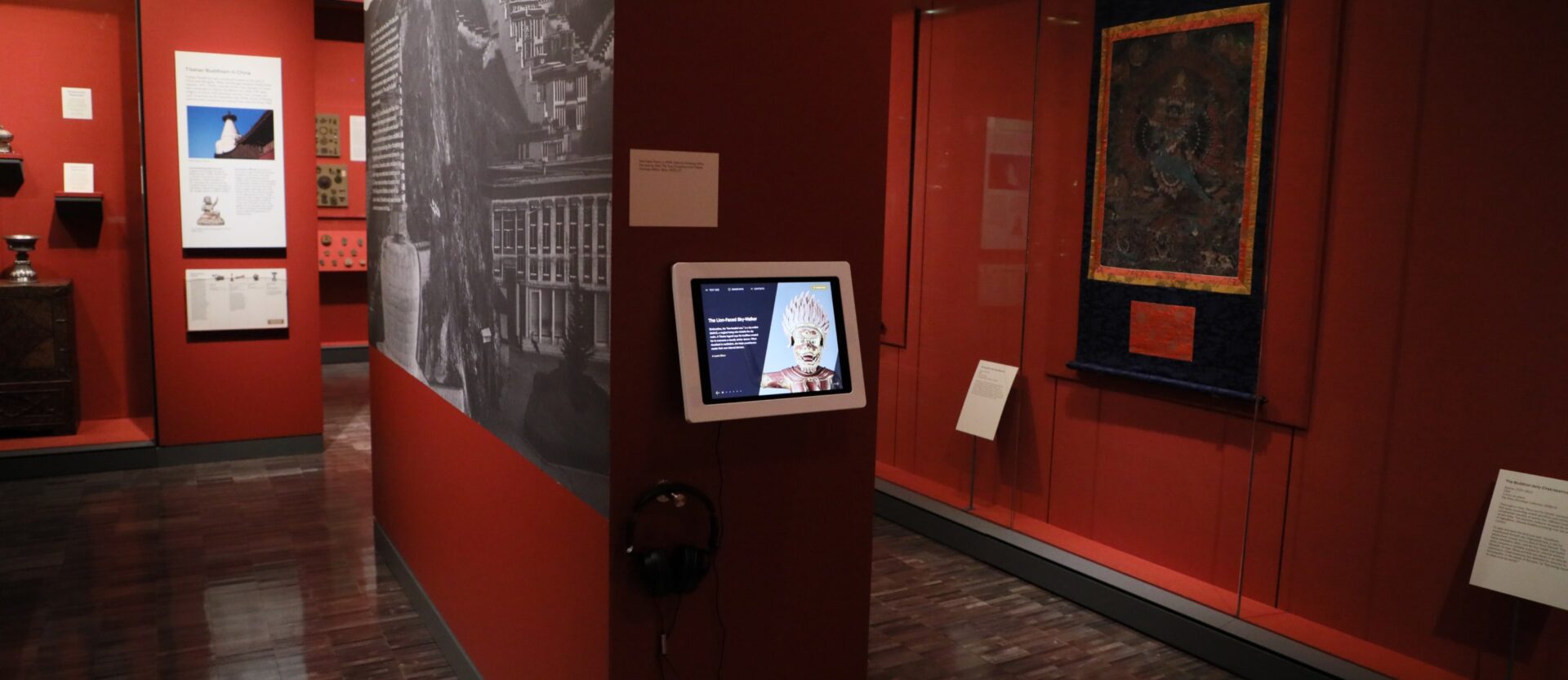
As part of the capital improvement for the new build-out of the Asian Art Museum’s floorplan, Lion was tasked with creating interactive, touch-based interpretive experiences for ten masterpieces across the museum. Our vision was to draw users in and provide a hands-on experience that simulates the sensation of touching these masterpieces. This involved allowing users to investigate all aspects of the artwork by moving and manipulating it, while curators provided commentary, images, and contextual information in an interactive and engaging way.
Services
- CMS Implementation
- CMS Strategy
- Product Design
- User Dashboard Design
Project Type
- Embedded Agile Team
- Marketing Strategy
- Product Experience Design
Utilizing a 3-D gaming engine to design a distinctive museum experience resulted in one-of-a-kind outcomes that are not typically seen in most interpretive experiences.
Like many technically challenging projects, achieving a solution that works for all stakeholders involved careful planning, frequent iteration, and extensive testing with end-users. This process was essential to strike the right balance of features that catered to the needs of museum stakeholders, curators, and visitors alike.
Key Challenges To Tackle on the Enterprise CMS
-
Accessibility Focus
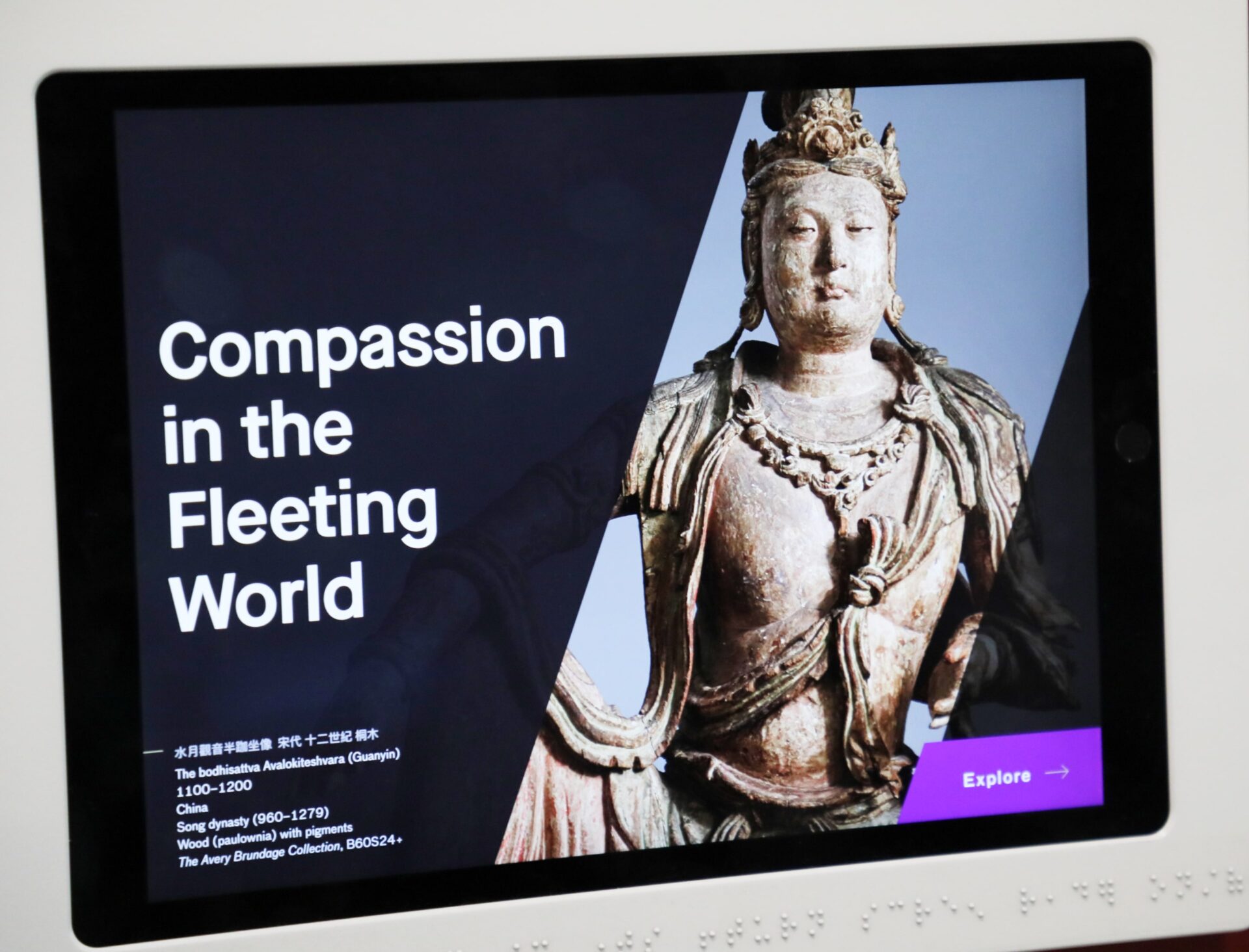
To comply with a city mandate for accessibility, the museum aimed to create an inclusive experience for all visitors. This required the development of additional layers to facilitate a tactile experience that would be accessible to visually impaired users.
-

Three Dimensional Photography
To achieve a fully immersive experience, we were presented with the chance to capture ten masterpieces using three-dimensional photography. These images would then be transformed into interactive exhibits, allowing visitors to spin objects, zoom in, and even move them.
-

Curated Experience
By partnering directly with the curatorial team, we were able to tap into decades of valuable insight on key masterpieces. This enabled us to weave a rich tapestry of storytelling and insights, resulting in a truly unique and immersive museum experience.
-

CMS Driven & Syncing
One critical aspect of developing a museum experience is considering how to push content updates and maintain the product. To address this, we designed an over-the-air syncing capability that would enable the main content management system to push coordinated updates to all tablets on a daily basis.
-

Multi Media
Our focus on meeting the 2.0 AA standard for accessibility allowed us to leverage various multimedia formats such as audio, video, and photography, resulting in a flexible and dynamic experience. This approach also ensured that the experience would be easily extensible for future growth.
-

Digital Branding Experience
Through our efforts across web, mobile, and digital signage, we successfully developed a cohesive digital brand that extended seamlessly into the tablet experience. This approach allowed for an on-brand approach that is not commonly seen in many museums.


A Museum App That Goes Beyond the Walls
One of the main objectives of this project was to create an engaging and educational experience that would capture the imaginations of both children and adults. In the process, we explored ways in which the app could be used beyond the museum, making it accessible to students worldwide. Our proof of concept and technical feasibility testing revealed numerous opportunities to use HTML and web protocols to extend the reach of this educational technology.
Unlocking New Insights Through UX-Focused Collaboration and Workshops
To ensure successful project outcomes, we often employ collaborative workshops with key stakeholders. Through an iterative process that begins with a proof of concept, we gather feedback that unlocks new insights and identifies areas for further focus. This approach allows us to move quickly and nimbly, gaining consensus and enabling team members to help steer product development. By leveraging the best ideas from all perspectives, our team creates an end product that is truly unified.
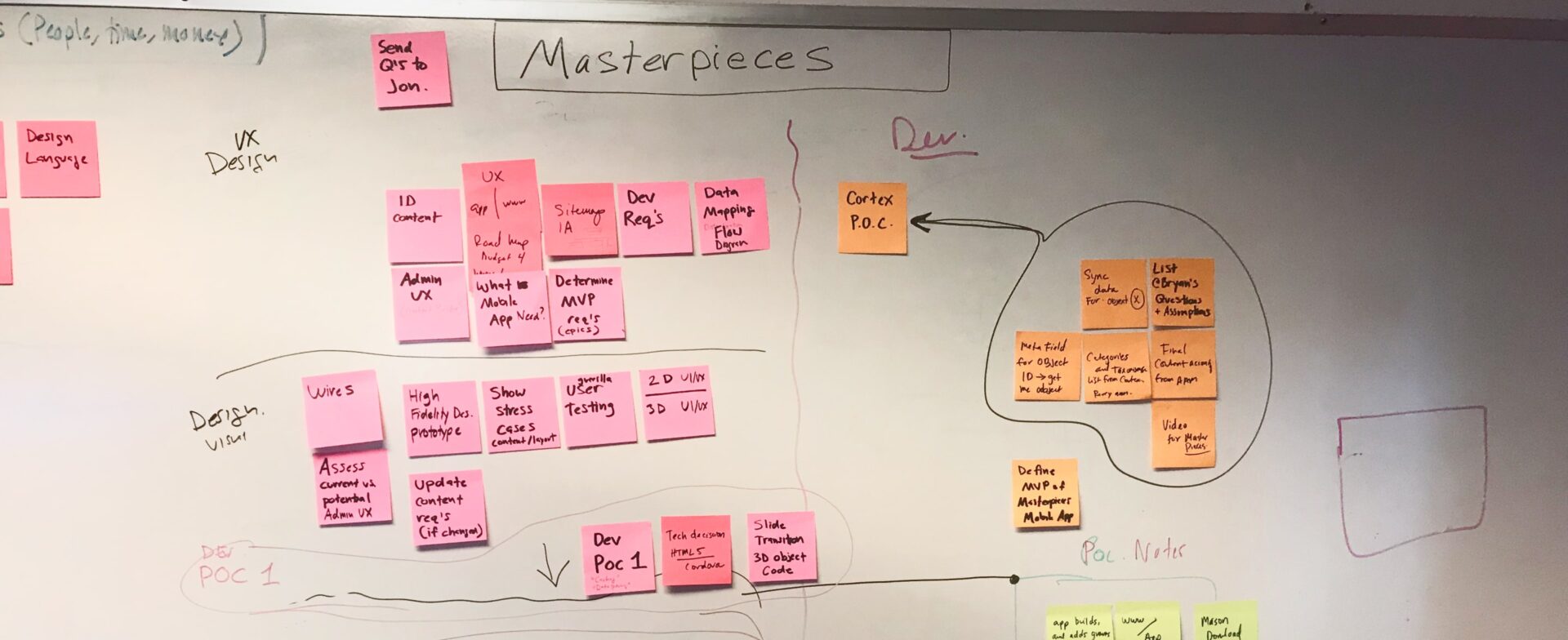

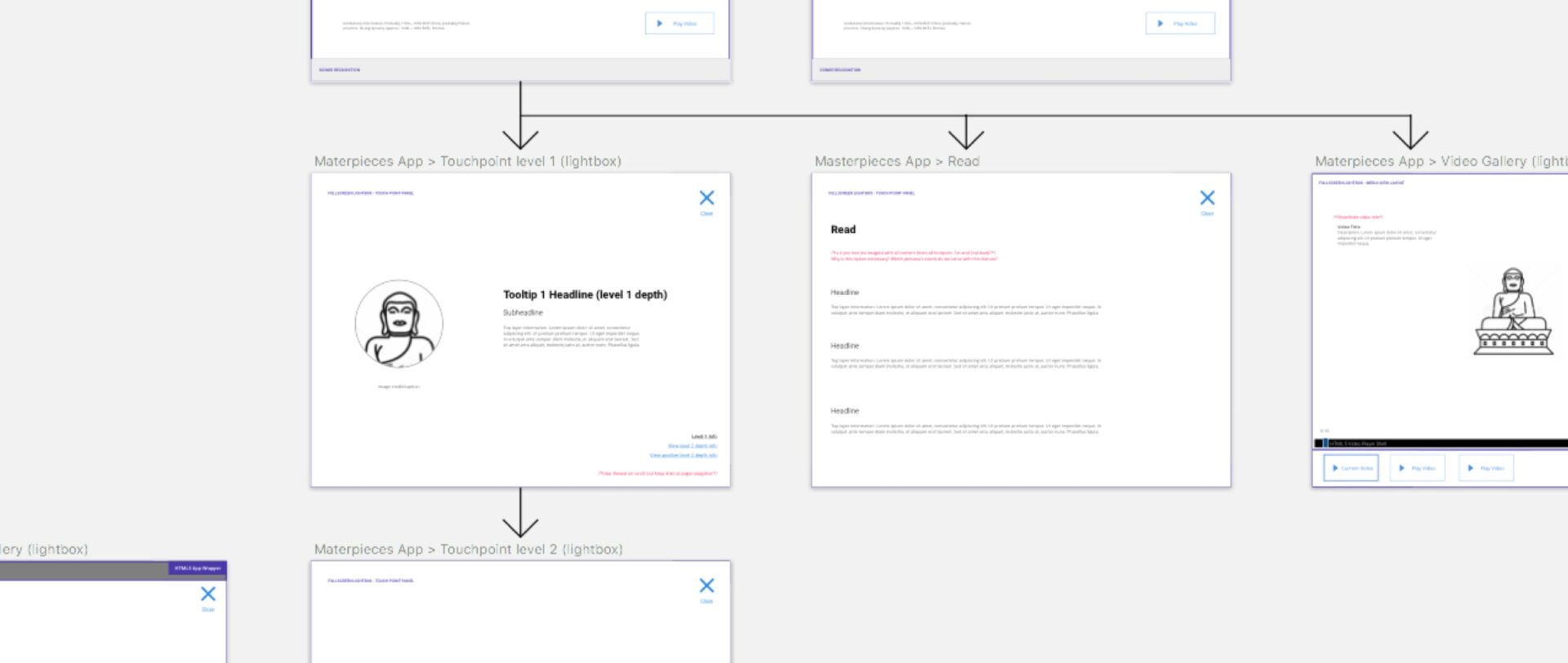
Building Better Products through Collaboration
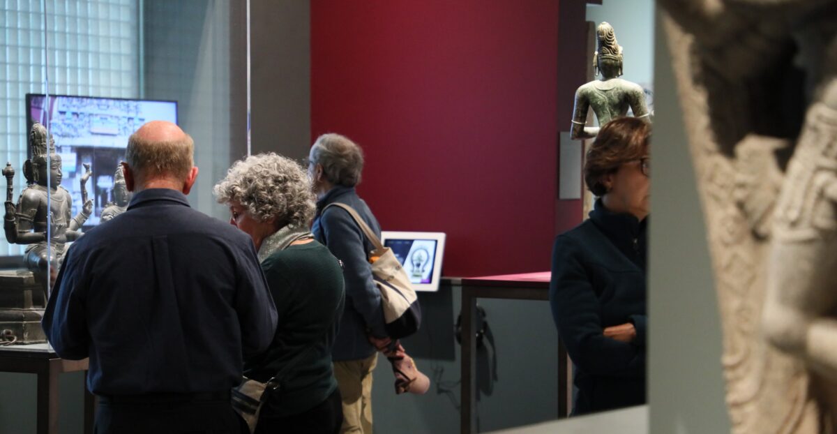
In many projects, there are multiple stakeholders involved, each with their own priorities and must-have lists for creating the final product. However, limitations and different perspectives can often lead to overwhelming amounts of requests and disagreements. Our approach is to prioritize and emphasize the best ideas through collaboration and workshops, while also being transparent and having accountability around decision-making. This leads to a better product and fosters happier, long-term relationships among stakeholders.

Deborah Clearwaters
Director of Education and Interpretation, Asian Art Museum

Yael Eytan
Chief Marketing and Communications Officer at Asian Art Museum

Jody Hart
Director Of Information Technology at Asian Art Museum

Jonathan Oen-Lee, MBA, ACLP
Director of Digital Experience
Achieving Clear Communication and Collaboration in Digital Transformation
Throughout the multi-year digital transformation of the Asian Art Museum, the Masterpieces app was just one component. Our ability to establish strong relationships and partnerships with key leaders over this time allowed for clear communication, a true sense of collaboration, and shared goals. This approach enabled us to make collective decisions based on a foundation of mutual understanding, data-driven goals, and a unified approach.
Accessible and Award-Worthy Experience
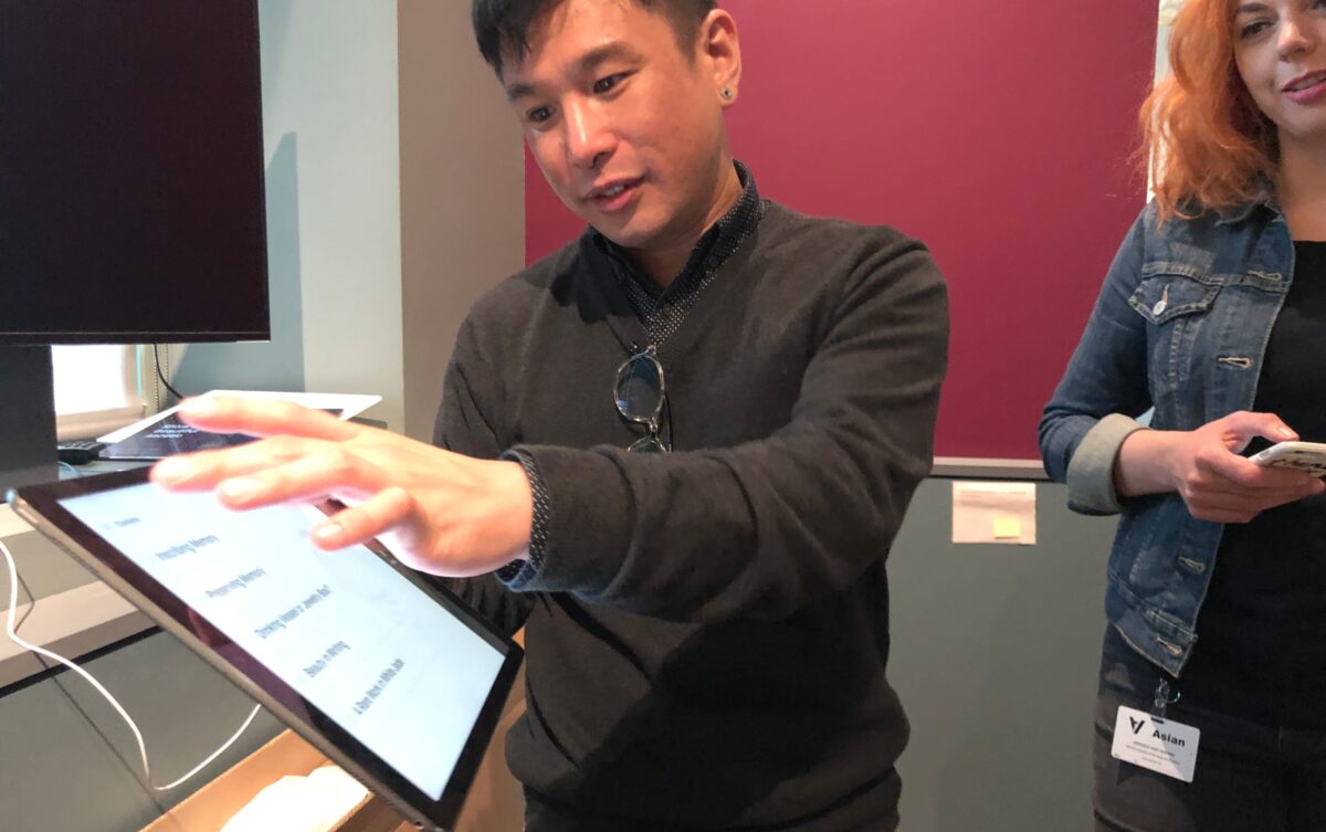
By prioritizing user experience along with stakeholder satisfaction, our design and engineering teams were able to craft an award-worthy experience..
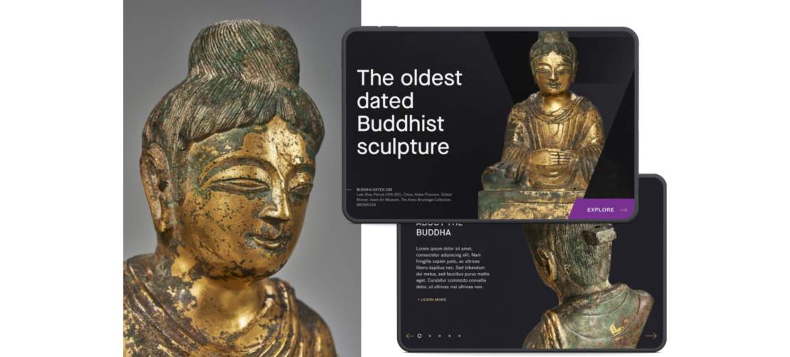

Our team's collective insights have not only pushed the boundaries of museum interpretive experiences but also raised the bar for accessibility and a universal approach to design within museums.
Revolutionizing Museum Education
Achieving the perfect balance between a visually engaging experience and accomplishing the key goal of the project, which is to enhance the overall museum experience for visitors, has led us to adopt an approach that integrates multimedia aspects with written text.
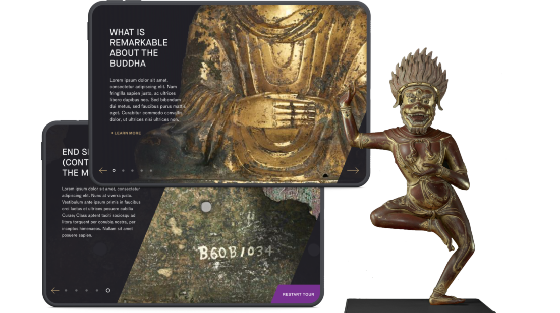

Similar to any effective educational experience, our system was designed to facilitate new insights, refinement of content, and the incorporation of additional features over time. To enable extensibility and ensure that the experience can expand over time, we developed an over-the-air syncing system
Simplifying Content Management
Our customized WordPress CMS implementation enables users to easily update content and save it without requiring any other fancy or complicated technology.
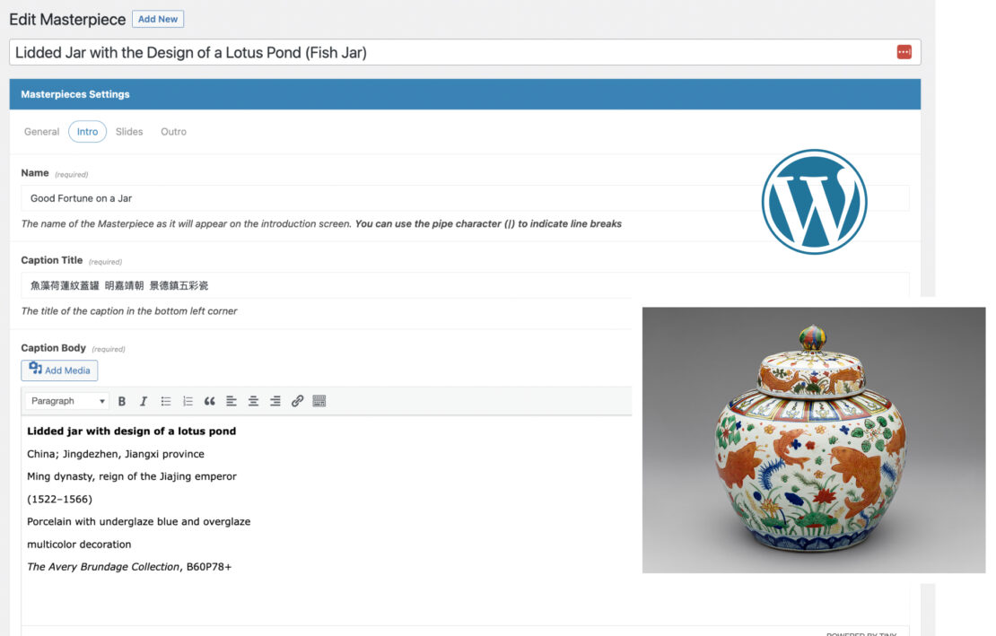

In addition to adhering to best practices for building an effective user experience for admins, we also adopt a UX-focused approach to understand how content creators interact with the system, identify their technological limitations, and build systems that accommodate their capabilities. This approach allows us to empower admin users to efficiently accomplish their tasks and achieve their goals.
Lighthouse for the Blind
-

Broken User Journey
After users signed up for a free trial of Lob, they a uncertain about how to effectively use the product, where the trial ended and actual implementation began.
-

Confusing Freemium Model
Many users were left uninformed about the 1000 free verifications they were entitled to before cutoff due to unclear marketing and post-sign-up communication.
-

Unclear Product Offering
Less tech-savvy users were presented with a demo widget that they mistook as the actual product, not realizing they needed to integrate it with an API.
-

No Friction to Convert
Users signed up for the free trial at the top of the marketing page with no barriers, preventing them from fully comprehending the offering.
