Tynker Case Study

Unleashing Growth Potential and Captivating Audiences for a Kids' Educational Coding Platform

Tynker, the leading educational coding platform for kids and teens, embarked on a growth journey following its acquisition by Byju’s, one of India’s largest educational platforms. While Tynker had already established itself as a renowned brand, the company recognized the need to enhance its growth potential and revitalize the visual aesthetics of its main website. The primary objective was to attract greater attention from parents and decision-makers, ultimately driving conversions to their paid plans.

Services

  • Product Evaluation
  • User Dashboard Design
  • User Journey Mapping
  • User Research

Project Type

  • Embedded Agile Team
  • Go To Market Strategy
  • Lead Generation
  • Learning Management System Integrations

Unpacking years of choices and understanding team politics was crucial in framing the problem to solve, leading to the distillation of their objectives.

Lion's approach involved devising a comprehensive strategy that addressed key areas, including minimizing friction, revitalizing the platform's visual appeal, and prioritizing an authentic user experience. By placing emphasis on compelling value propositions and captivating storytelling, their goal was to foster meaningful connections with both children and parents, cultivating enduring relationships.

Uncovering the Root Causes

Delving into Inputs to Distill Key Pain Points; Analyzing Details to Align on Effective Solutions

  • User Research & Data Analysis

    By leveraging data and gathering real user feedback, we gained valuable insights into the key personas and their interdependencies.

  • User Journey Audit and Heuristic Evaluation

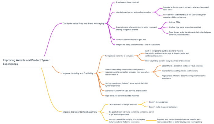
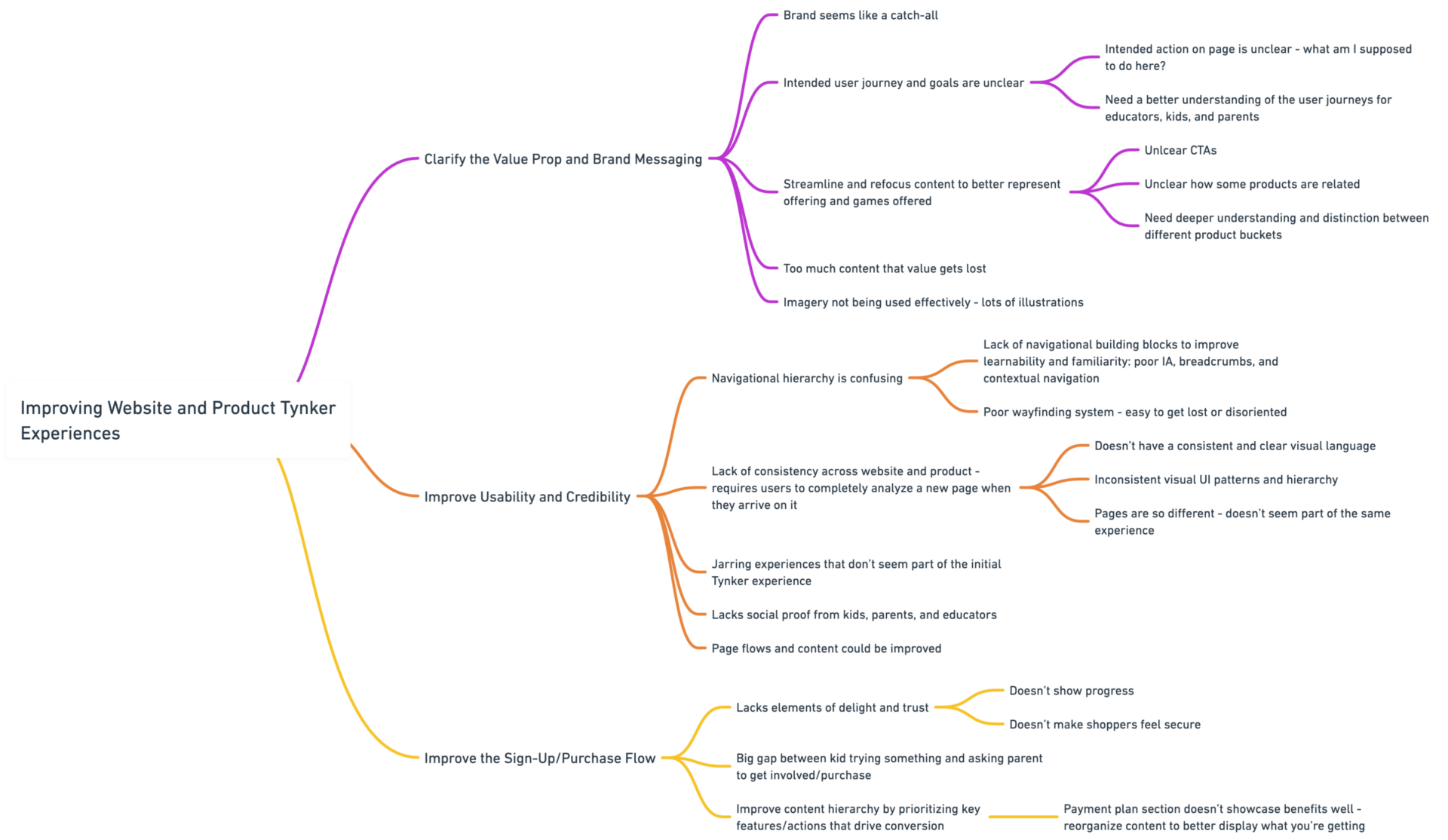
    Through conducting our own heuristic evaluation and audit, involving both parents and children, we uncovered significant opportunities to improve and enhance funnel support.

  • Aligning Intentions and Clear Brand Direction

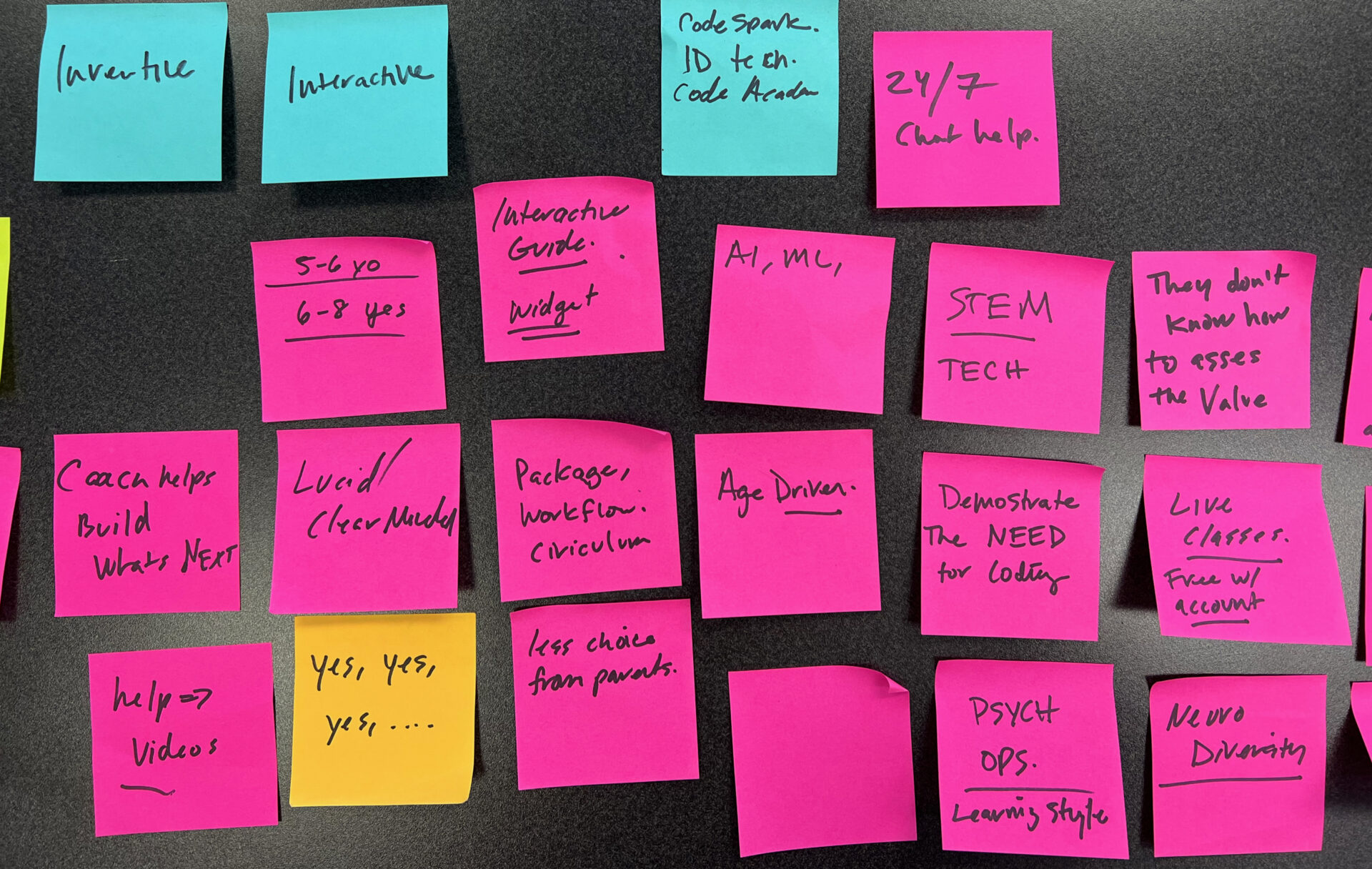
    By honing in on the brand's desired perception and how they aimed to be received, we successfully aligned team members and objectively crafted a guiding North Star that reflected the organization's goals.

  • Aligning Business Needs with User-Centric Solutions

    By engaging directly with leadership, we gained a deep understanding of the business needs. This enabled us to engage in divergent ideation and subsequently converge on solutions that effectively addressed user needs.

Understanding Users on a Deeper Level

Leveraging Persona Research and In-Depth Interviews for Informed Design Decisions

For the Tynker platform, we conducted extensive proxy research and distilled interviews to develop personas for teachers, parents, and kids & teens. By gaining deep insights into their unique needs, motivations, and pain points, we were able to create tailored experiences that catered to each persona group, ensuring a user-centric design approach. This user-focused strategy allowed us to address the specific challenges and deliver meaningful value to teachers, parents, and the young learners themselves, fostering engagement and facilitating a seamless educational coding experience.

Leveraging Persona Research and In-Depth Interviews for Informed Design Decisions

Teachers

The persona for teachers emphasized their desire for an easily teachable curriculum that demystified coding, relieving them of the need for extensive coding knowledge. They also expressed concerns about pricing and technology, seeking lessons that were not only effective for learning but also aligned with their budget and supported by accessible technology.

Leveraging Persona Research and In-Depth Interviews for Informed Design Decisions

Parents

The parents persona prioritized an educational coding platform that was intuitive and supported their child's growth in a rapidly evolving world where coding skills are increasingly essential for future job opportunities. They valued the availability of tutors and sought product features that alleviated the burden of personally training their children. Tynker addressed these needs by offering a comprehensive educational experience, intuitive interface, access to tutors, and supportive features that empowered parents to nurture their child's coding journey with confidence.

Leveraging Persona Research and In-Depth Interviews for Informed Design Decisions

Kids

The kids persona prioritized a fun and engaging learning experience, seeking a platform that was easy to understand while still offering powerful coding capabilities. They appreciated rewards and incentives as motivational factors and valued the ability for their parents to actively support their growth on the platform. By catering to these preferences, Tynker crafted an interactive and enjoyable environment that empowered kids to explore coding, earn rewards, and receive parental guidance, fostering a positive and supportive learning journey.

Utilizing Style Scapes to Define the Aesthetic Direction and User Experience

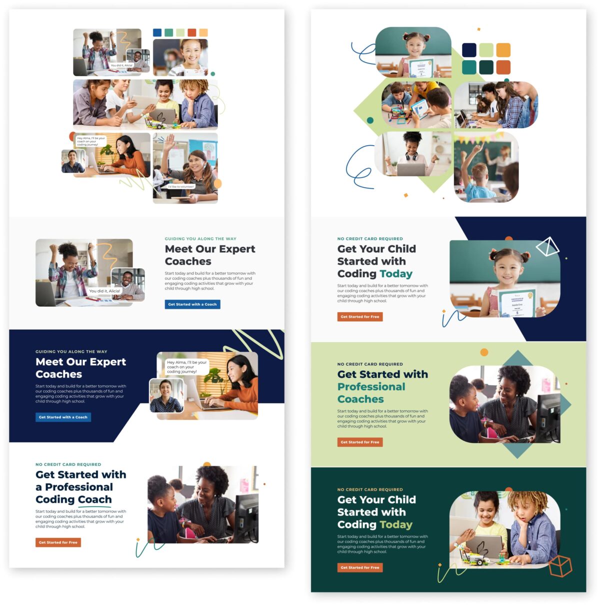
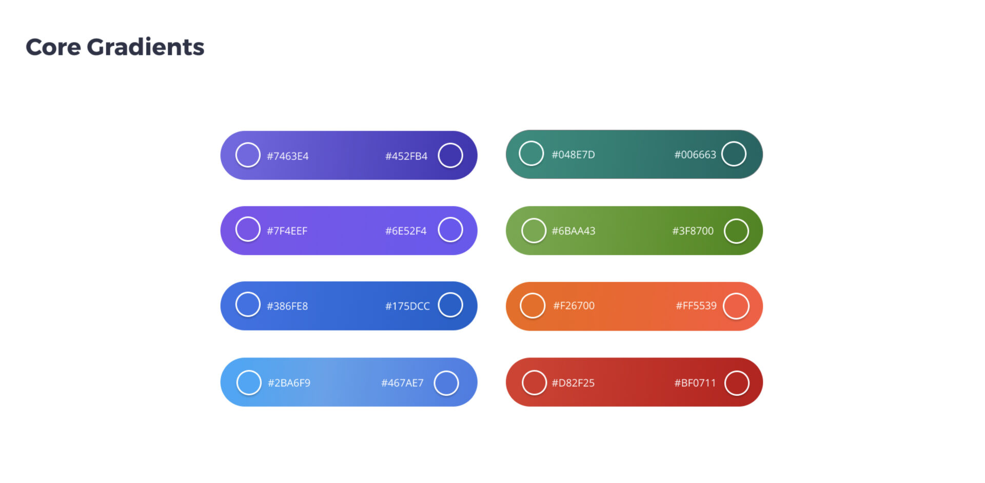
We utilized our brand mission statement workshop to establish a clear and objective approach to designing, aligning our efforts with a North Star that embodied our core objectives. With this foundation in place, we created three distinct visual design approaches, carefully analyzing each one to determine which approach best captured and articulated the essence of our brand mission. This meticulous evaluation process allowed us to select a visual design direction that authentically represented and conveyed our brand's purpose to the target audience.

Wireframes to Visual Iterations

Synthesizing Understanding, Threading Visual Choices, and Iterating on the Home Page Design

In the subsequent project phase, we focused on designing the home page by synthesizing our insights to create wireframes. Through a process of iterative feedback and refinement, we fine-tuned the wireframes to ensure a smooth and intuitive user experience. Building upon this solid foundation, we incorporated selected visual design approaches, continuously iterating on the home page to achieve a visually captivating and engaging interface that seamlessly blended functionality with an accessible, fun, trustworthy, and educational appeal.

Iterative Refinement

Leveraging Agile Design Principles to Enhance Visual Elements and Drive User Engagement

To finalize the page updates, we utilized prototyping and iterative feedback loops. Through this process, we developed functional prototypes that allowed stakeholders to experience the proposed changes firsthand and provide valuable feedback. By incorporating stakeholder insights and iterating on the prototypes, we achieved a refined and polished design that aligned with the project goals and satisfied the needs and expectations of all stakeholders involved.

Strengthening Relationships and Encouraging Conversion

Harnessing Email Campaigns to Keep Parents Informed and Showcase Platform Value

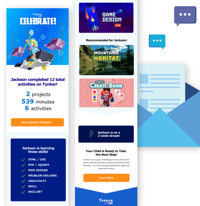
Our approach involved harnessing the power of strategic email communication to drive parent engagement, demonstrate the value of the platform, and encourage conversion to paid plans. Through targeted email campaigns, we kept parents informed about kids progress, showcased the benefits of our offerings, and provided exclusive incentives to drive conversion. By nurturing these relationships and effectively communicating the value of the platform via personalized emails, we fostered strong parent engagement and successfully increased conversion rates.
Streamlining Onboarding Flows: Reducing Friction and Enhancing Perceived Value

In this phase, we focused on streamlining and cleaning up the onboarding flows to minimize friction and elevate the perceived value of the product. By carefully analyzing user feedback and behavior, we identified pain points and areas of improvement within the onboarding process. Through thoughtful redesign and optimization, we created a seamless and intuitive onboarding experience that not only reduced friction but also enhanced the perceived value of the product, setting the stage for enhanced user engagement and satisfaction.

Our relentless pursuit of user satisfaction and conversion success led us on a transformative journey. By meticulously refining onboarding flows, we eliminated obstacles and ushered in a seamless user journey that captivated parents and children alike. Drawing inspiration from the realm of boundless creativity, we unveiled vibrant and engaging visual approaches that amplified the users perception of the brand.

Made with Love
in The Bay Area
We're an award-winning interactive agency specializing in digital applications, user experience design, marketing-driven funnels, and brand strategy.
Facebook